

A SaaS metrics dashboard is a single, live view of the KPIs that predict revenue health and flag decisions before they become crises. It replaces the monthly scramble to reconcile spreadsheets with one governed source that product, growth and finance teams check daily or weekly.
At minimum, yours needs:
- MRR/ARR and the month-on-month growth rate
- Churn split by logo and revenue
- Net revenue retention (NRR)
- Customer acquisition cost (CAC)
- Customer lifetime value (LTV)
- Activation rate and trial-to-paid conversion
- Expansion revenue from upsells and cross-sells
- A clear note on data sources feeding each figure
None of this works if the underlying numbers disagree with your billing platform. Governed metric definitions and reconciled data from Stripe, Xero or whatever you run underneath are what separate a credible dashboard from a spreadsheet someone will contradict in the next board meeting.
Key Takeaways
A board-ready SaaS metrics dashboard combines governed metric definitions, reconciled billing data, and stage-appropriate KPIs refreshed on a cadence matched to how fast each number can change.
PointDetailsStart with the core eightTrack MRR, churn, NRR, CAC, LTV, activation, expansion revenue, and cash runway from day one.Group metrics by categoryOrganise growth, retention, engagement, and economics metrics separately to avoid a wall of noise.Match cadence to decision speedRefresh MRR and churn daily or weekly; review NRR, CAC payback, and cohort metrics monthly.Reconcile against billing systemsGoverned definitions mapped to Stripe or Xero prevent boardroom disputes over conflicting numbers.Prioritise by company stageFocus on activation and churn early, NRR and CAC payback at growth stage, Rule of 40 at scale.
Table of Contents
- What is a SaaS metrics dashboard, and who actually uses it?
- Which SaaS KPIs belong on the dashboard, and how do you calculate them?
- How should you structure dashboards for different teams?
- Which tools and templates actually work for building one?
- Which metrics matter most at each company stage?
- How do you keep the dashboard accurate and board-ready?
- What widgets should actually be on the page?
- Where dashboards go wrong when people read them
- How do you automate updates and alerts without creating noise?
- What happens when teams actually use dashboards well?
- Get your dashboard reconciled and board-ready
- The gap between dashboard software and dashboard discipline
- Frequently asked questions
- Sources
What is a SaaS metrics dashboard, and who actually uses it?
Strip away the tooling and a SaaS metrics dashboard is a live report card built from three data sources: billing, CRM and product usage. It exists to answer one question fast: is the business getting healthier or not? A well-built version pulls MRR from your billing system, pipeline data from your CRM, and activation or engagement figures from your product analytics, then reconciles them so the numbers agree with your actual books.
Different people lean on it for different reasons:
- Founders and CEOs scan it weekly to catch churn spikes or growth slowdowns early
- Heads of growth track CAC and conversion by channel daily
- Product managers watch activation and feature adoption
- Finance leads use it to reconcile recognised revenue against billing data
- Investors expect a version of it in every board update
Geckoboard’s dashboard examples show this pattern clearly: combining billing, product and CRM feeds gives leadership a daily snapshot instead of waiting on a monthly close.
Which SaaS KPIs belong on the dashboard, and how do you calculate them?
Group your metrics or the dashboard turns into noise. Four categories cover almost everything a SaaS business needs to track, and Stripe’s metrics taxonomy organises the same territory around acquisition, engagement, retention and economics, with a clear steer that engagement and retention are the stronger leading indicators of revenue health, ahead of raw signups.
Growth metrics track the top line. MRR is your total recurring revenue normalised to a monthly figure; ARR is simply MRR times 12. Your MRR growth rate is (this month’s MRR minus last month’s) divided by last month’s, and a proper MRR bridge breaks that change into new, expansion, contraction and churned revenue so you can see which lever actually moved the number.
Retention metrics tell you whether you’re keeping what you win. Logo churn is customers lost divided by customers at period start. Revenue churn does the same calculation in pounds. NRR takes starting revenue from existing customers, adds expansion, subtracts contraction and churn, then divides by the starting figure.
Engagement metrics catch problems before they show up in revenue. DAU/MAU ratio measures stickiness. Activation rate is the share of new signups who reach a defined “aha” milestone within a set window. Trial-to-paid conversion is self-explanatory but brutally revealing when it drops.
Economics metrics measure efficiency. CAC is total sales and marketing spend divided by new customers acquired. LTV estimates total revenue per customer over their lifetime. CAC payback tells you how many months it takes to recover acquisition cost. LTV:CAC above 3:1 is the commonly cited healthy threshold, and burn multiple (net burn divided by net new ARR) tells you how efficiently cash is turning into growth.
MetricFormulaRefresh cadenceMRR / ARRSum of recurring revenue (× 12 for ARR)DailyRevenue churnRevenue lost ÷ starting revenueWeeklyNRR(Start + expansion − contraction − churn) ÷ startMonthlyCACSales & marketing spend ÷ new customersMonthlyLTV:CACLifetime value ÷ CACQuarterlyActivation rateActivated users ÷ new signupsWeekly
Pro Tip: Watch for proration traps. A customer who upgrades mid-cycle can look like churn and new revenue simultaneously if your billing system splits the invoice, doubling your apparent volatility for no real reason.
Refunds and mid-cycle downgrades are the two most common sources of dashboard disputes. If your billing timing doesn’t match your revenue recognition, your MRR figure and your accountant’s figure will diverge, and someone in the board meeting will notice.
How should you structure dashboards for different teams?
Not everyone needs the same view. Fairview’s dashboard template organises everything around four questions: Revenue, Customer, Efficiency and Operations, and that structure scales cleanly across team-specific views.
- Executive/board view: MRR, NRR, churn, CAC payback, cash runway. Monthly, sometimes weekly.
- Finance/board pack: recognised revenue reconciled to billing, gross margin, burn rate. Monthly.
- Growth/marketing view: CAC by channel, conversion funnel, pipeline coverage. Daily or weekly.
- Product/engagement view: activation rate, feature adoption, DAU/MAU. Weekly.
- Retention/customer success view: cohort NRR, logo churn by segment, expansion pipeline. Weekly or monthly.
Every view needs the same underlying integrations: your billing platform, CRM, product analytics tool, and accounting system, all reconciled so nobody’s pulling contradictory numbers into the same meeting.
Pro Tip: Cap the primary view at 8 to 12 metrics. Beyond that, engagement drops because nobody scans a wall of numbers properly, and drill-down pages exist for a reason.
Which tools and templates actually work for building one?
You’ve got four realistic routes, and the right one depends on your data volume and how many revenue streams you’re reconciling.
- Spreadsheet templates (SimpleSheets, downloadable KPI templates) work well early on. Pre-built formulas for MRR, churn and LTV get you a working dashboard in an afternoon, though spreadsheet-based templates require manual updates that become unsustainable past a certain customer count.
- Dashboard builders like Klipfolio pull multiple data sources into one visual layer without heavy engineering.
- Product analytics platforms like Amplitude and ChartMogul specialise in engagement cohorts and subscription analytics respectively, and both offer purpose-built SaaS templates.
- Unified SaaS BI platforms like Basedash and UXCam connect billing, CRM and product data with governed metric definitions baked in, cutting the time to a board-ready dashboard significantly.
Early-stage teams should start with a spreadsheet template and graduate once manual reconciliation starts eating a day a week. Growth-stage teams generally need a dedicated BI tool once they’re juggling more than one pricing model. Scale-stage teams need integrated BI with an audit trail investors can query directly.
Pro Tip: If you’re spending more than two hours a month manually reconciling dashboard numbers to your billing system, that’s your signal to upgrade tooling, not add another spreadsheet tab.
Which metrics matter most at each company stage?
Metric priorities shift as the business matures, and UpliftGTM’s guidance is blunt about it: the wrong metric focus at the wrong stage wastes attention on numbers nobody’s ready to act on yet.
- Seed/early stage: focus on MRR momentum, activation rate and early churn signals. The rule here is simple: prove people use and keep using the product before anything else matters.
- Series A/growth stage: shift attention to NRR, CAC payback and LTV:CAC. The rule: prove the growth engine is efficient enough to fund itself.
- Scale/late stage: track the Rule of 40 (growth rate plus profit margin), gross margin, burn multiple and cohort NRR by segment. The rule: prove the business scales without burning disproportionately more cash.
Build your first dashboard around whichever stage you’re actually in, not the one you aspire to. A pre-revenue startup obsessing over burn multiple is measuring the wrong problem; defer segment-level cohort analysis to drill-down views until you have enough customers per segment for the numbers to mean anything.
How do you keep the dashboard accurate and board-ready?
Every dashboard eventually gets challenged in a board meeting, and the ones that survive have governed definitions everyone agreed on in advance. That means writing down exactly how you calculate MRR, churn and NRR, mapping each figure to its billing or accounting source, and assigning someone ownership of the definitions themselves.
- Maintain one documented definition per metric, with an audit log of any changes
- Map every dashboard figure back to its billing or accounting source system
- Assign clear ownership: who can change a metric definition, and who signs it off
- Reconcile MRR against recognised revenue on a monthly cycle at minimum
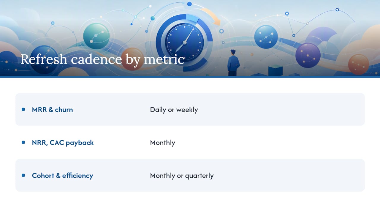
Cadence should track how fast a number can meaningfully move and how quickly someone needs to act on it. MRR and churn shift daily or weekly and belong on an operational cadence. NRR and CAC payback move more slowly and suit weekly or monthly review. Cohort and efficiency metrics rarely need more than monthly attention.
Pro Tip: When your dashboard MRR and your accountant’s recognised revenue disagree, don’t average the two. Reconcile them properly, and if the gap persists, loop in accounting support that works directly with your billing platform. Definite’s best-practice guide makes the same point: disconnected reporting is the single biggest source of board-meeting disputes.
What widgets should actually be on the page?
A dashboard is only as good as its individual widgets. Here’s a working set for a single executive page:
- MRR total + bridge: line chart with new/expansion/contraction/churn breakdown; alert on any month-on-month drop
- Daily churn heatmap: table or heatmap; alert if daily churn exceeds a rolling average
- Cohort NRR chart: line chart by signup month; alert if any cohort drops below 90%
- Activation funnel snapshot: funnel visual; alert on week-on-week conversion drops
- CAC by channel: bar chart; alert if any channel’s CAC exceeds LTV/3
- LTV curve: line chart by cohort age
- Pipeline coverage gauge: gauge visual; alert below 3x coverage
- Cash runway indicator: single number with trend line; alert under six months
A growth-focused view narrows this down to the funnel and CAC widgets; an executive view keeps all eight for a full health check in one scroll.
Where dashboards go wrong when people read them
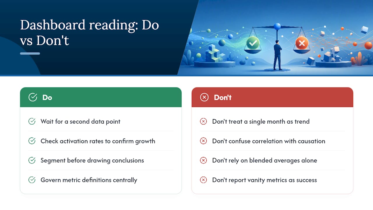
The most common mistake is treating a single month’s number as a trend. MRR can dip because of one large customer’s billing cycle, not because the business is struggling, and reacting to noise wastes far more time than waiting for a second data point.
Confusing correlation with causation runs a close second. A spike in signups after a marketing push looks great until you check activation rates three weeks later and find most of those signups never used the product. Growth in the top of the funnel means nothing if it doesn’t survive contact with the activation metric underneath it.
Averages hide the real story more often than they reveal it. A blended CAC across five channels can look healthy while one channel bleeds money and another quietly outperforms everything else. Segment before you conclude anything.
Vanity metrics creep in too easily. Total signups, app downloads and pageviews feel good to report but rarely predict revenue. Stick to the metrics that Stripe’s own taxonomy flags as leading indicators, engagement and retention, rather than raw acquisition volume.
Finally, watch for stale definitions. A metric calculated one way in January and a slightly different way in June, because someone tweaked the formula without telling anyone, produces a chart that looks like a trend when it’s actually a definition change. This is exactly why governed metric ownership matters more than the dashboard software you pick.
How do you automate updates and alerts without creating noise?
Manual refreshes are the single biggest reason dashboards go stale. Connect your dashboard directly to source systems, billing via Stripe or similar, CRM, and product analytics, using native integrations or a sync tool, so figures update automatically rather than waiting on someone to export a CSV.
Alerts need thresholds, not just visibility. Set a churn alert for anything above your rolling three-month average rather than an arbitrary fixed number, since a fixed threshold either fires constantly or never fires at all as the business scales. CAC payback and cash runway suit similar rolling-average logic.
Route alerts to the person who can actually act on them. A churn spike should hit customer success, not the whole company distribution list, or people learn to ignore the noise within a fortnight. Reserve company-wide alerts for genuinely board-level events: a material MRR contraction, a runway threshold, a covenant breach.
Build in a reconciliation check as an automated step too. A weekly automated comparison between your dashboard’s MRR figure and your billing platform’s own total catches drift before it becomes a board-meeting argument, rather than after.
Pro Tip: Set alert thresholds using rolling averages, not fixed numbers. A fixed churn alert that made sense at 50 customers will either misfire constantly or stay silent forever once you hit 500.
What happens when teams actually use dashboards well?
The companies that get real value from a SaaS metrics dashboard tend to share one habit: they check it before problems become crises, not after. A growth-stage team watching CAC by channel weekly can catch a paid channel’s efficiency collapsing within days rather than discovering it at quarter-end when the marketing budget’s already spent.
Retention dashboards catch a different kind of problem. A cohort NRR chart that starts sliding for customers signed up six months ago, while newer cohorts look fine, usually points to a specific product or onboarding change made around that time. Without the cohort breakdown, that signal gets buried inside a single blended NRR number that looks perfectly healthy.
Board reporting benefits the most from consistency. Investors comparing a company against 2025 SaaS benchmark data expect governed, reconciled figures they can trust quarter over quarter, and a dashboard that reconciles cleanly to billing and accounting systems shortens due diligence considerably compared with one built from ad hoc spreadsheets assembled fresh each time.
The pattern holds across stages: the value isn’t the dashboard software itself, it’s the discipline of checking the right numbers on a cadence that matches how fast they can actually change.
Get your dashboard reconciled and board-ready
Building the dashboard is the easy part. Keeping the numbers on it honest, month after month, as your billing platform, CRM and product analytics all evolve independently, is where most founders run out of time. That reconciliation work, tying MRR back to recognised revenue, mapping churn to actual contract terms, keeping your metric definitions consistent as the business grows, is exactly the kind of ongoing discipline that Priceandaccountants builds into cloud accounting work for tech and fintech clients.
If you’re running Xero or a similar platform alongside Stripe and want your dashboard figures to survive investor scrutiny without a scramble before every board meeting, Priceandaccountants’ accounting services handle the reconciliation layer so your MRR, churn and revenue figures agree with your actual books, not just your spreadsheet. For SaaS businesses juggling SEIS/EIS compliance alongside growth reporting, that governance work tends to matter more than which dashboard tool you pick.
The gap between dashboard software and dashboard discipline
Most advice on this topic obsesses over which tool to buy. That’s the wrong starting point. A brilliant BI platform connected to unreconciled billing data produces confident-looking nonsense faster than a spreadsheet ever could, because the polish makes people trust numbers they shouldn’t.
What the evidence here actually supports is a boring conclusion: governance beats tooling. The businesses that avoid board-meeting disputes are the ones that wrote down their metric definitions before picking software, not after. They know exactly how MRR reconciles to recognised revenue, and they know who owns that definition when someone wants to change it.
The other place conventional advice falls short is stage-blindness. Plenty of dashboard templates hand a seed-stage founder the same 20-metric layout meant for a Series B board pack. That’s not thoroughness, it’s noise that buries the two or three numbers that actually matter right now. Start narrow, prove the stage-appropriate metrics matter, then expand.
If you take one thing from this, prioritise reconciliation before dashboard aesthetics. A dashboard investors trust is worth more than one that merely looks impressive.
Frequently asked questions
What’s the difference between a SaaS metrics dashboard and a general business dashboard?
A SaaS metrics dashboard is built around subscription-specific metrics like MRR, churn and NRR, which don’t exist in the same form for non-recurring revenue businesses. A general business dashboard tends to focus on broader figures like total sales and gross profit without the cohort and retention detail a subscription model demands.
How many metrics should a SaaS dashboard actually show?
Keep the primary view to 8 to 12 metrics. Beyond that threshold, engagement drops noticeably because reviewers stop scanning properly, so push everything else into drill-down pages rather than cramming it onto the main screen.
Which SaaS KPI matters most for investors?
Net revenue retention tends to carry the most weight because it shows whether existing customers are expanding or shrinking their spend, independent of new sales. CAC payback and the Rule of 40 matter more as the company scales.
Do I need a dedicated BI tool, or is a spreadsheet enough?
A spreadsheet template works fine for early-stage teams with a single pricing model and limited customer volume. Once reconciliation starts taking more than a couple of hours a month, or you’re juggling multiple revenue types, a dedicated BI tool or unified SaaS platform earns its cost.
How often should SaaS dashboard data refresh?
Match refresh frequency to how fast the number can meaningfully change. MRR and churn suit daily or weekly updates; NRR and CAC payback work fine on a monthly cycle; cohort-level and efficiency metrics rarely need refreshing more than monthly or quarterly.
Sources
For a working spreadsheet, Discovering SaaS’s KPI template covers pre-built MRR, churn and LTV formulas. For benchmarking your numbers against peers, the 2025 SaaS Performance Metrics Benchmarks report filters by company size and pricing model. For metric taxonomy and definitions, Stripe’s SaaS metrics guide is the clearest reference available. For reconciliation and financial governance support, see Priceandaccountants’ financial KPI guide for founders.
- SaaS company dashboard example | Geckoboard
- SaaS Metrics: A Complete Guide to Tracking Business Growth | Stripe
- SaaS Metrics Dashboard Template: Free Download — Fairview
- SaaS Metrics: 15 KPIs Every B2B Leader Must Track 2026 | UpliftGTM
Recommended
- Financial metrics for tech startups: 2026 investor guide - Price & Accountants
- What is SaaS accounting? A UK tech startup guide 2026 - Price & Accountants
- Why Cloud Accounting Matters: Fuelling Growth for SMEs and Start-ups - Price & Accountants
- Financial reporting for scale-ups: a 2026 guide - Price & Accountants